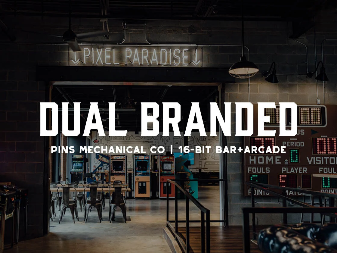
Pins + 16-Bit Brand Integration
In leading the NSO design team for our Charlotte location, a 23,000 sq/ft dual-branded facility, I was faced with the challenge of integrating two different aesthetics into one cohesive experience. From the material finishes, to the interior graphics, and branding elements, we established a creative balance that allowed the vintage industrial aesthetic of Pins Mechanical to integrate with the quirky retro vibe of 16-Bit Bar+Arcade.
Since it’s opening in December, this dual-branded redesign and strategy has resulted in a +200% revenue increase per weekend of operation.

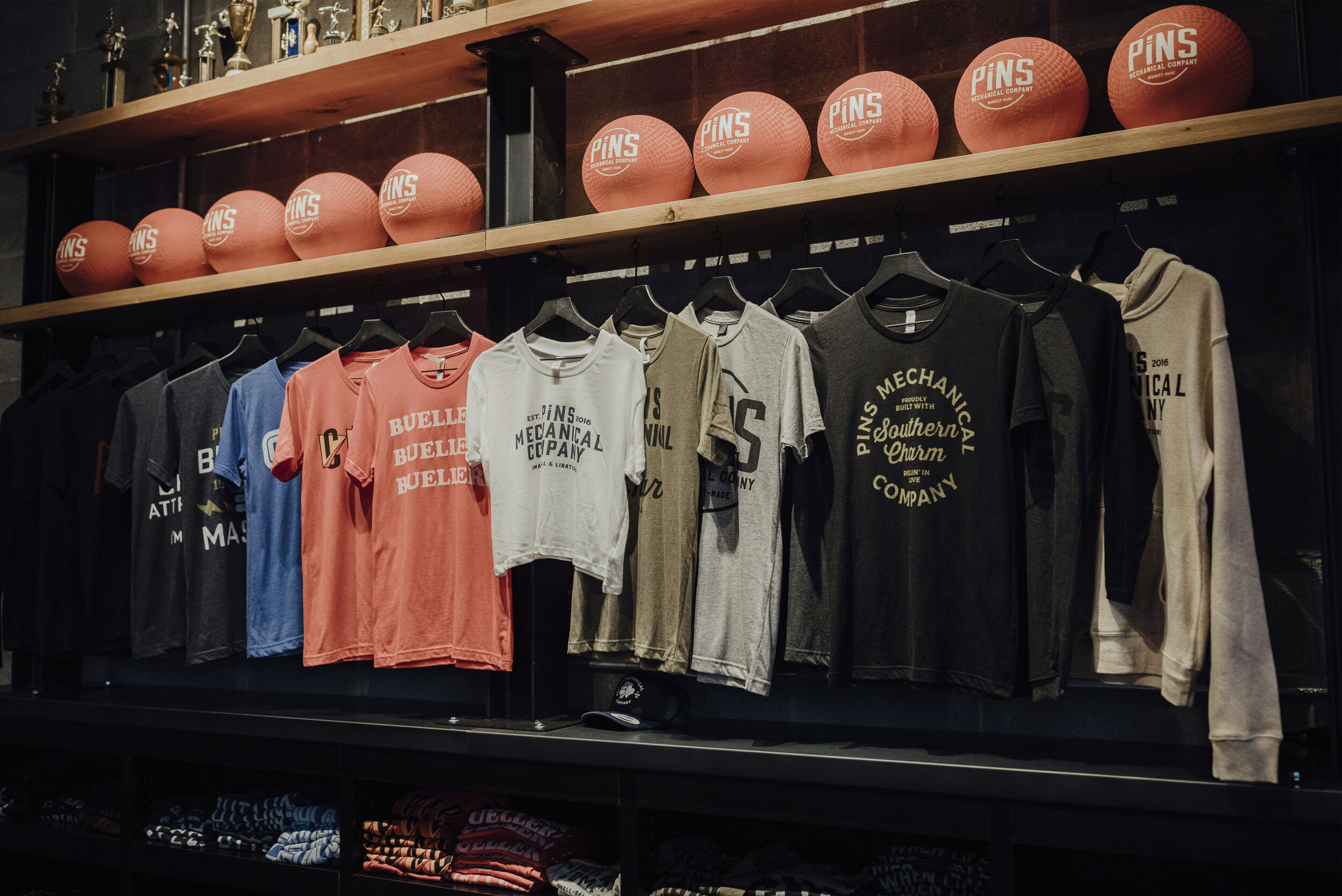
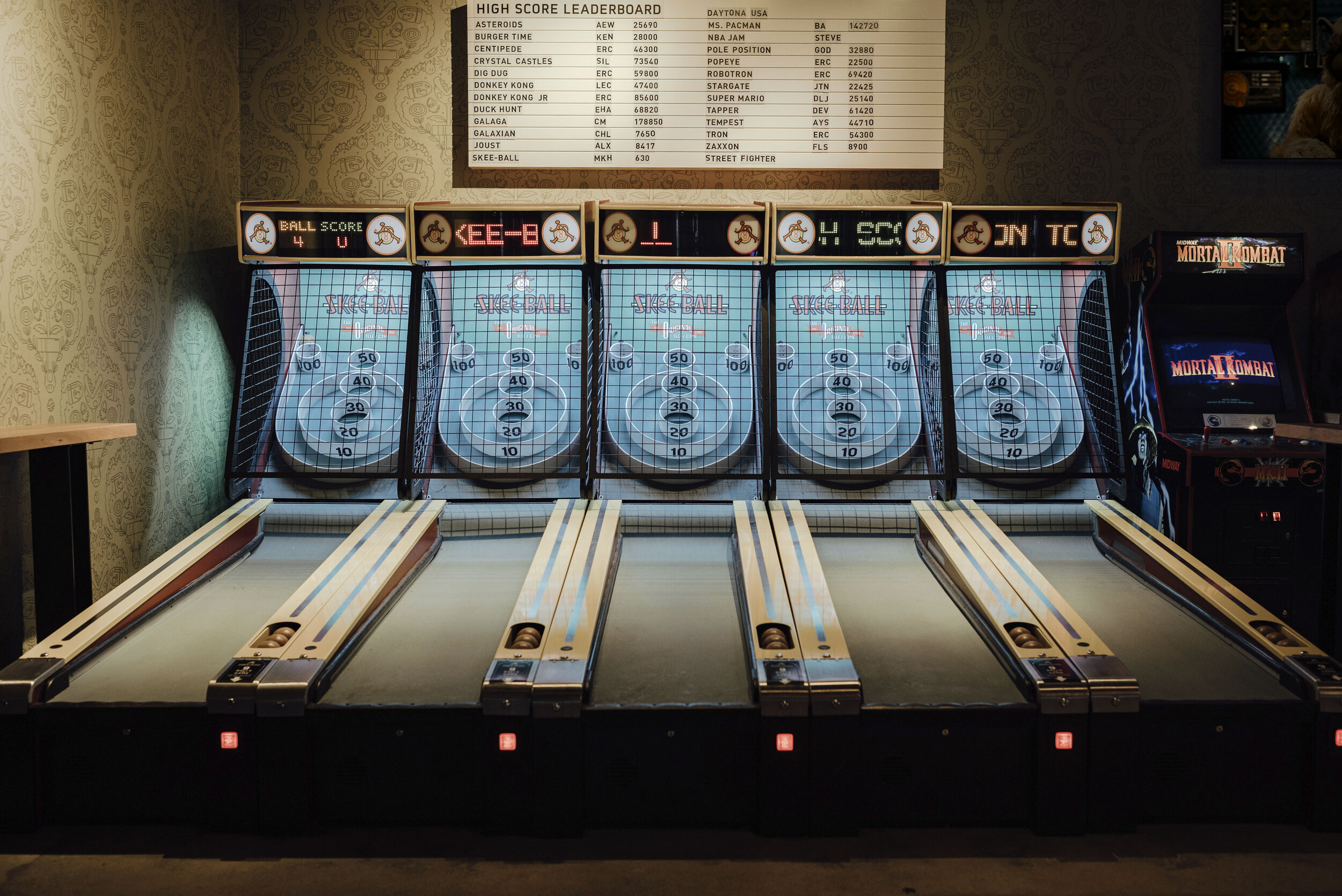
Every element of the bar experience was thoughtfully crafted and designed - from the hand painted murals, floor graphics, menus, and duckpin balls, to every piece of merchandise we sell. All of the Pins branding is inspired by raw mechanical finishes and old-school graphics that were prominent in 1950’s and 60’s mechanic shops.


Through the layering of installations, textured green walls, vintage murals, and neon accents we created a multi-sensory experience that triggers a memorable nostalgia in all of our guests.

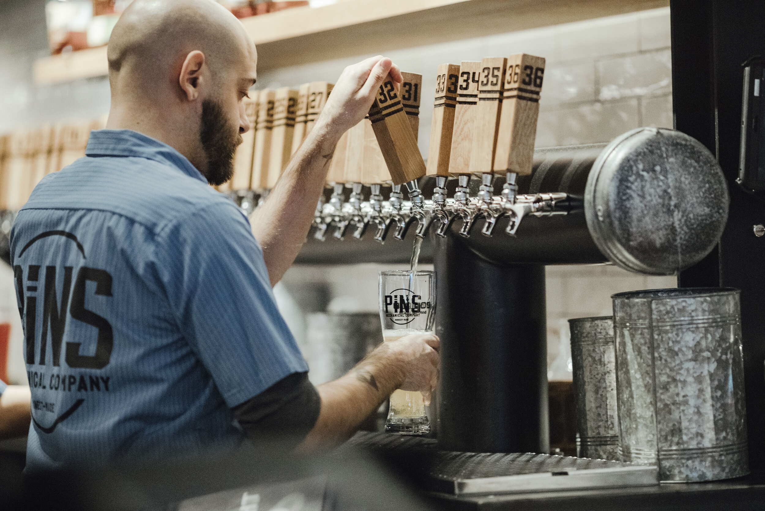
To further reinforce the 50’s era, we designed staff uniform to be reminiscent of the old-school mechanic shirts - old-school retro name tags included!

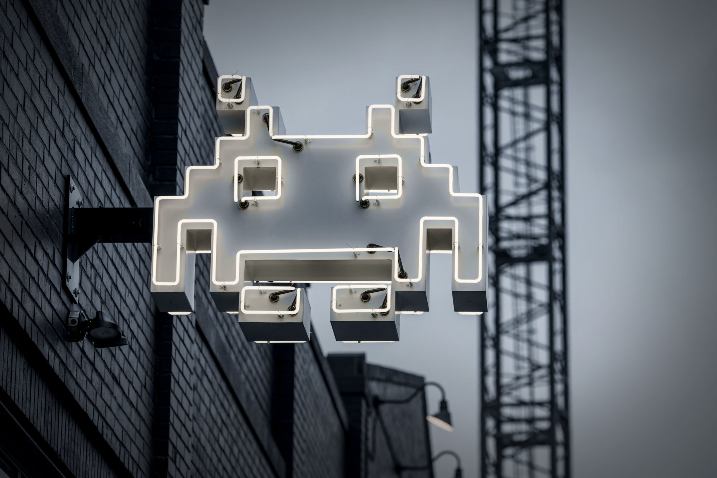
Transitioning from Pinhead Paradise to Pixel Paradise, we injected more eye-catching 80’s neons and redesigned the retro inspired “Icon-Wall” in black and white to more cohesively tie-in with the vintage photography from Pins.


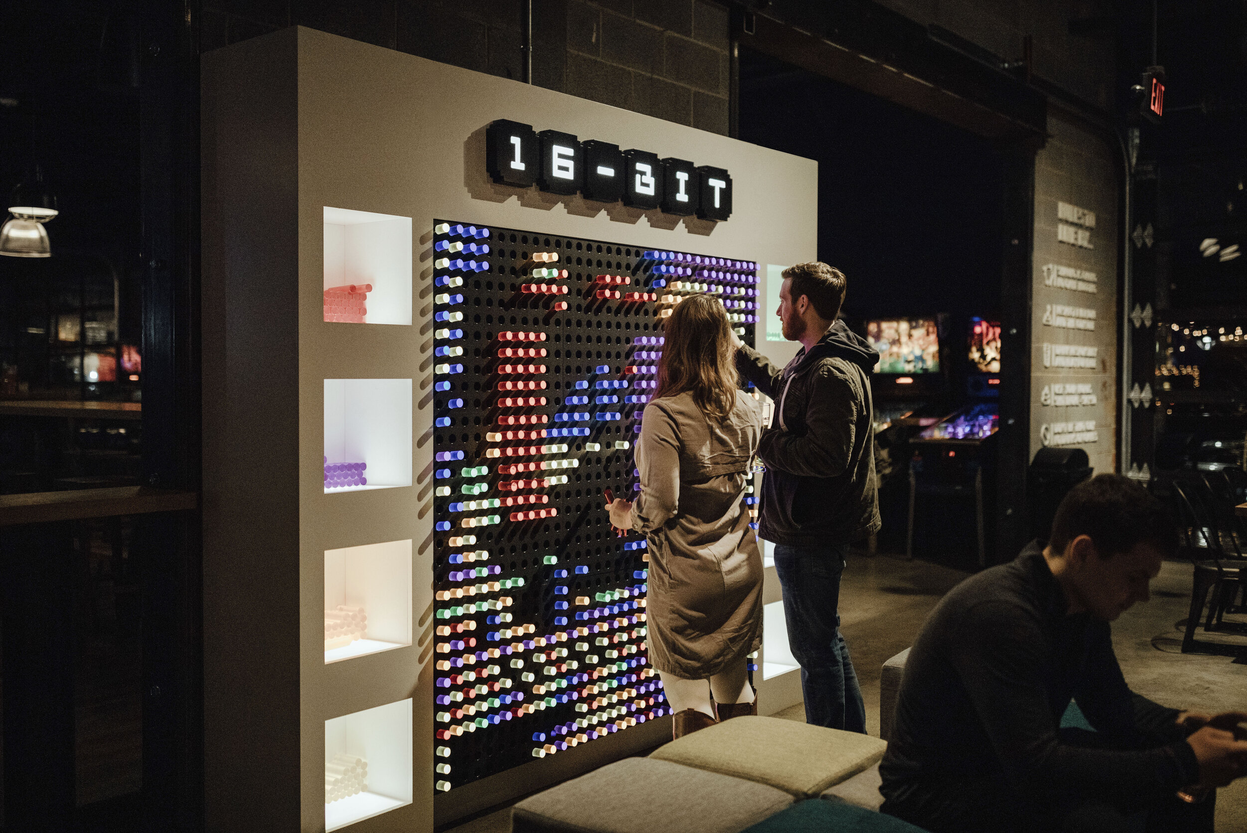
The 16-Bit custom designed wallpaper is also a nice transition between the two brands. From far away it has a 50’s inspired vibe, but on closer inspection, it’s revealed that the vintage pattern is actually created out of the original characters from Super Mario Bros.
In reducing some of the funky 16-Bit design elements, we were still able to preserve that old-school 80’s swag by using the neons as an eye-catching focal point of the brand experience. Pushing the bathroom selfies to the max, we created “Journey” inspired neons that delineated the men’s and women’s restrooms, a photo-op no guest can resist!


With the Charlotte location, we even incorporated the pop of neon in the exterior signage.